- Networking, Cisco Visual."Forecast and methodology, 2010-2015." White paper. (2011).
- Networking, Cisco Visual. "Cisco global cloud index: Forecast and methodology, 2016–2021." White paper. Cisco Public, San Jose 1 (2016).
を元に可視化。
table データ
import pandas as pd
import matplotlib.pyplot as plt

# Data (2010-2015)
data_2010_2015 = {
    "Year": [2010, 2011, 2012, 2013, 2014, 2015],
    "Data Center to User": [179, 262, 363, 489, 635, 815],
    "Data Center to Data Center": [75, 110, 150, 198, 252, 322],
    "Within Data Center": [887, 1279, 1727, 2261, 2857, 3618]
}

# Data (2016-2021)
data_2016_2021 = {
    "Year": [2016, 2017, 2018, 2019, 2020, 2021],
    "Data Center to User": [998, 1280, 1609, 2017, 2500, 3064],
    "Data Center to Data Center": [679, 976, 1347, 1746, 2245, 2796],
    "Within Data Center": [5143, 6831, 8601, 10362, 12371, 14695]
}

# Convert to DataFrame
df_2016_2021 = pd.DataFrame(data_2016_2021)
df_2010_2015 = pd.DataFrame(data_2010_2015)

# Merge the dataframes to have a complete dataset from 2010 to 2021
df = pd.concat([df_2010_2015, df_2016_2021]).reset_index(drop=True)
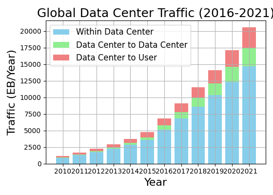
年毎の(1) データセンタとユーザー間、(2) データセンタ間、(3) データセンタ内(ラック内通信は除く)の推移。単位はEB。
| Year | Data Center to User | Data Center to Data Center | Within Data Center |
|---|---|---|---|
| 2010 | 179 | 75 | 887 |
| 2011 | 262 | 110 | 1279 |
| 2012 | 363 | 150 | 1727 |
| 2013 | 489 | 198 | 2261 |
| 2014 | 635 | 252 | 2857 |
| 2015 | 815 | 322 | 3618 |
| 2016 | 998 | 679 | 5143 |
| 2017 | 1280 | 976 | 6831 |
| 2018 | 1609 | 1347 | 8601 |
| 2019 | 2017 | 1746 | 10362 |
| 2020 | 2500 | 2245 | 12371 |
| 2021 | 3064 | 2796 | 14695 |
可視化
scale = 0.8
plt.figure(figsize=(7 * scale, 5 * scale))

# Plotting stacked bar chart
plt.bar(df['Year'], df['Within Data Center'], label='Within Data Center', color='skyblue')
# plt.bar(df['Year'], df['Within Data Center'], label='データセンタ内', color='skyblue')
plt.bar(df['Year'], df['Data Center to Data Center'], bottom=df['Within Data Center'],
        label='Data Center to Data Center', color='lightgreen')
plt.bar(df['Year'], df['Data Center to User'],
        bottom=df['Within Data Center'] + df['Data Center to Data Center'],
        label='Data Center to User', color='lightcoral')

# Adding titles and labels
plt.title('Global Data Center Traffic (2016-2021)', fontsize=18)
plt.xlabel('Year', fontsize=16)
plt.ylabel('Traffic (EB/Year)', fontsize=16)
plt.xticks(df['Year'])
plt.legend(fontsize=12)
plt.grid("--")

# Show the plot
plt.tight_layout()
plt.show()